2026 Posters
Many followed the call for posters and the results are AMAZING. We thank all participants for the great work! Some more information can be found on our call for posters.
Click on thumbnail to download the full poster’s PDF
Michael Olanrewaju
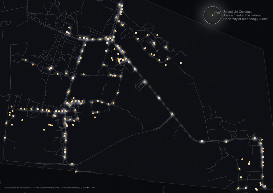
Access to reliable electricity and functional street lighting is an important aspect of campus accessibility, safety, and everyday mobility. In 2024, a group of young mappers (YouthMappers FUTA) set out to document the electricity situation around the Federal University of Technology, Akure (FUTA), Nigeria, with a focus on streetlights and dark areas within the campus environment. The project responded to growing concerns from students who frequently move across campus between classes and their residences, especially at night, when lighting conditions directly affect safety and ease of movement. Streetlight mapping was used as a practical tool to identify dark and well-lit zones across the campus. The project aimed to assess and categorise streetlights based on their working condition and power source, identify clusters of damaged or non-functional streetlights for targeted maintenance, locate areas where streetlights had been removed for better road organisation, and map poorly lit regions, particularly along road networks. This map visualises the results of the field mapping exercise, showing streetlight data and a 17-meter buffer of streetlight access across the campus.
Gabriel Kasmi
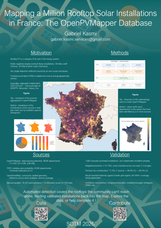
Rooftop photovoltaic (PV) systems account for the vast majority of PV grid connections, yet no open, comprehensive, installation-level dataset of these systems exists: public registries aggregate data only above a capacity threshold, and remote sensing-based detection efforts, while extensive, are typically confined to a single method, a limited geographic scope, or a single point in time. We introduce OpenPVMapper, a nationwide, multi-source database of rooftop PV installations in mainland France, built by aggregating and reconciling complementary sources: a deep learning-based detection pipeline deployed on nationwide aerial imagery, OpenStreetMap and a probabilistic building-level detection dataset. The resulting database contains 1,135,850 installations, totaling approximately 15.01~GWp of installed capacity, each documented with its provenance, detection method, and, where available, a manual validation flag. Manual review of a stratified sample of 1,862 installations places the database’s overall precision at approximately 74–75%, with corroboration across independent sources bringing a substantial, quantified precision gain. By aggregating independent sources rather than relying on any single detection method, OpenPVMapper reaches a level of confidence beyond what any one source could provide on its own, while remaining extensible to further sources as they become available. It is released under an open (CC-BY) license alongside the full source code used to build it. Project page: gabrielkasmi.github.io/deeppvmapper/.
This poster provides a broad overview of the OpenPVMapper initiative. It builds upon my PhD thesis work, where I mapped rooftop PV systems over France. The core mapping work is fully open sourced, so is this enriched database. OpenPVMapper aggregates various mapping efforts (openly available), including mine, to provide the most comprehensive rooftop PV database to date. Rooftop PV is a category of its own, and yet no comprehensive, individual-level database is available. OpenPVMapper aims to bridge this gap. The main interesting result is that having two independent sources greatly improves the precision of the detections. I aim to provide regular updates of the PV mapping, and wish to launch challenges to validate the detections and thus improve the referencing of rooftop PV systems within OSM, so as to improve energy system mapping and contribute to ongoing efforts for mapping distributed energy sources.
Eleanor Denneman
Md. Musayeedur Rahman
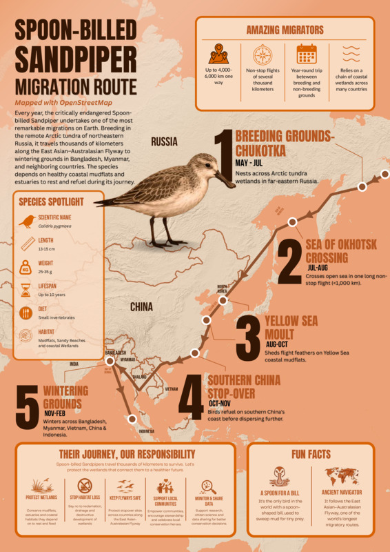
This poster illustrates the annual migration route of the Spoon-billed Sandpiper (Calidris pygmaea), one of the world’s most critically endangered shorebirds. The migration route, determined by a number of geographical locations and plotted on OpenStreetMap, displays the bird’s travel from its native habitat to winter grounds in Southeast Asia. The migration is part of the natural behavior of the species and takes it through critical refueling sites along the East Asian-Australasian Flyway. In addition to providing important insights on the ornithological aspect of the migration, the poster also displays the relevance of conserving these sites that are located in coastal waters and provide shelter and nourishment to a variety of waterfowls. The poster was created in such a way as to display the usefulness of geographical information in general and OpenStreetMap in particular in conveying the message of the importance of protecting animals and habitats. It demonstrates how migration of animals can be converted into a powerful infographic that raises awareness about the challenges of biodiversity conservation. Through effective use of maps and scientific imagery this poster brings awareness to one of the world’s most threatened shorebirds and makes the viewer more informed about the importance of international efforts to preserve the migratory routes that are vital to this and many other species.
The poster was created using QGIS and OpenStreetMap. The migration route was manually entered into the system based on peer-reviewed research. In addition to this, AI was used to generate some of the icons in the poster, as well as for proofreading the poster. The research, data collection, route interpretation, map design, infographic making, and text writing were all done manually by the author of the poster.
Christian Quest
Panoramax, OpenStreetMap
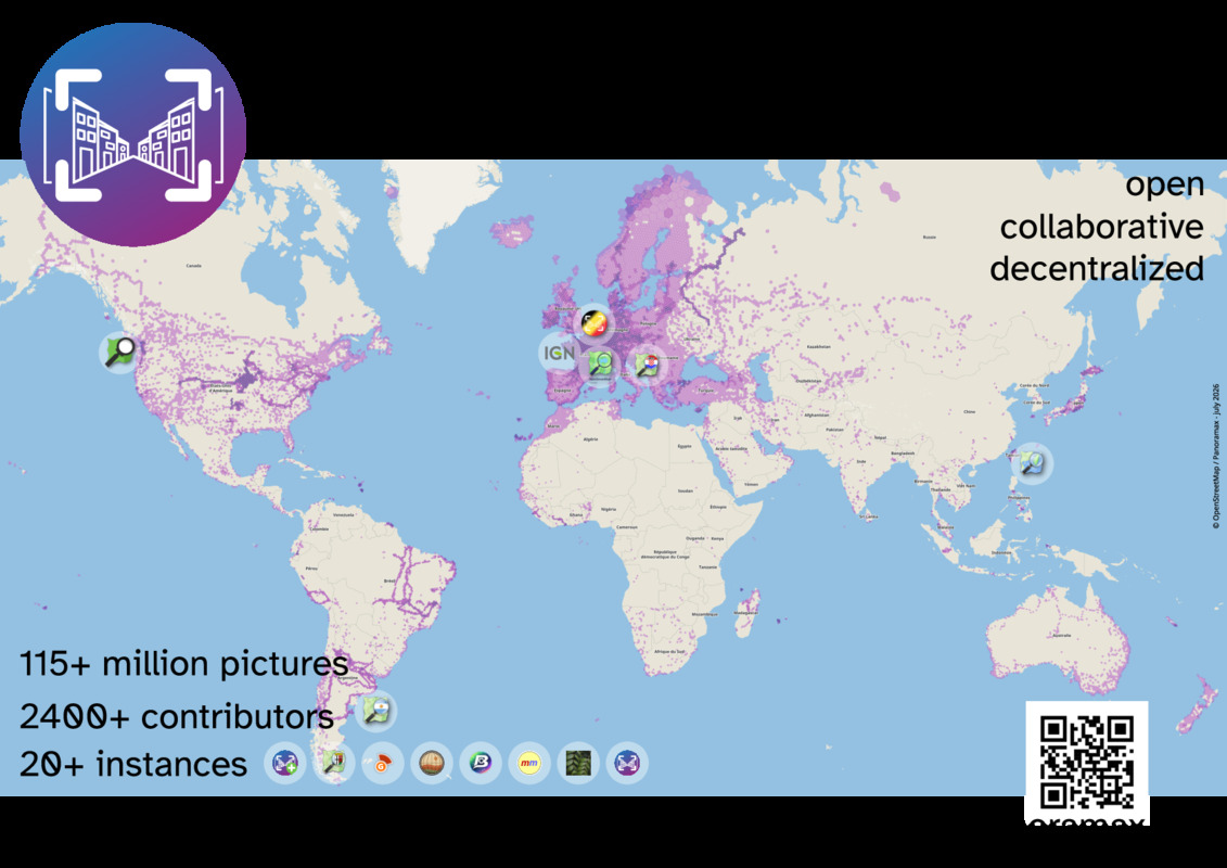
Panoramax global coverage and main instances
Julien Minet
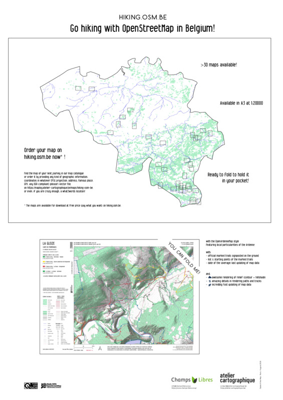
This map presents the hiking.osm.be project. Hiking.osm.be offers high quality, topographic, paper maps to download in Belgium. The maps are based on the OpenArdenneMap style, a Mapnik and QGIS map style dedicated to the OpenStreetMap data model for producing paper maps in the Ardenne region. See github.com/nobohan/OpenArdenneMap/ for more information. The project started in 2022 and it is still alive. It is an example how OpenStreetMap - not only the data but the people contributing to it - can be used to produce high quality maps adapted to a local context. Recently, we made some improvements to the OpenArdenneMap style by using map generalisation techniques. We see a growing interest in this kind of maps in the local tourism sector in Belgium.
Feye Andal, Erika Joy Del Rosario
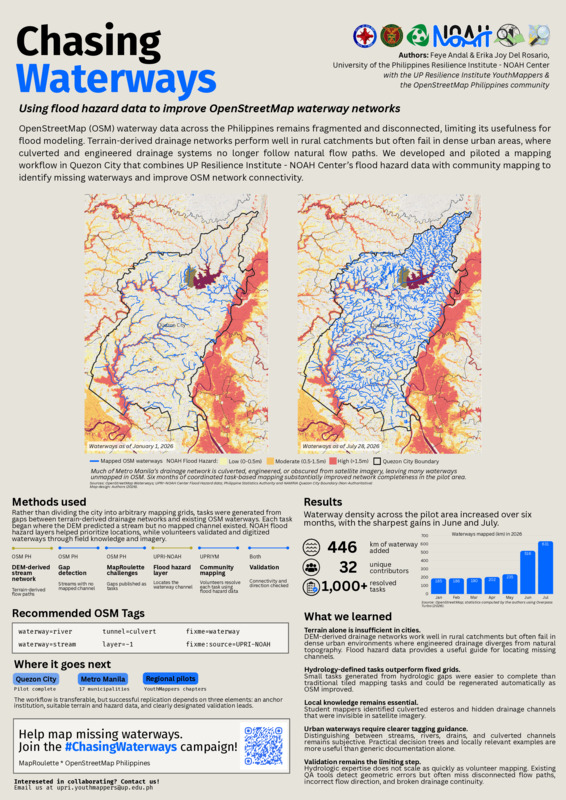
OpenStreetMap (OSM) waterway data across the Philippines remains fragmented and disconnected, limiting its usefulness for flood modeling. Terrain-derived drainage networks perform well in rural catchments but often fail in dense urban areas, where culverted and engineered drainage systems no longer follow natural flow paths. We developed and piloted a mapping workflow in Quezon City that combines UP Resilience Institute - NOAH Center’s flood hazard data with community mapping to identify missing waterways and improve OSM network connectivity.
Hanifa Huwaida
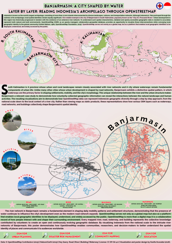
This poster, From an Archipelago to a River City, highlights how OpenStreetMap can represent Indonesia’s geographic identity across various spatial scales. The visualization starts at the national level, emphasizing Indonesia’s status as the world’s largest archipelago, then gradually shifts to South Kalimantan, and finally focuses on the city of Banjarmasin, which is internationally known for its extensive river network. Rather than presenting OpenStreetMap as a collection of individual features, this poster demonstrates how various map layers interact to illustrate the city’s form. Waterways serve as a natural framework, the road network reflects terrestrial connectivity, and buildings showcase the community’s adaptation to a water-dominated environment. Collectively, these layers communicate Banjarmasin’s spatial identity as a river-oriented city. This project was developed entirely using openly available OpenStreetMap data, processed through QGIS, and graphically designed using Canva. The result underscores the value of crowdsourced geographic information not only as a navigation tool but also as a medium for conveying local geographic knowledge to an international audience. This poster demonstrates how collaborative mapping can transform individual geographic features into meaningful spatial narratives.
Generative AI (ChatGPT and Quillbot) was used to improve the English wording and grammar of the poster text. The concept, map design, cartographic workflow, spatial data processing, visualization, and all analyses were independently developed by the author using OpenStreetMap data, QGIS, and Canva.
Tobias Augspurger et al.
Tobias Augspurger, Marina Petkova, François Lacombe, Andreas Hernandez Denyer
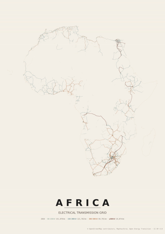
Africa’s high-voltage power grid seen through OpenStreetMap. The poster offers a unified view of Africa’s high-voltage transmission backbone as currently mapped in OpenStreetMap, revealing both the structure of the grid and the gaps in our collective knowledge. Stark contrasts emerge across the continent. Countries such as South Africa, Ethiopia, Egypt, and parts of the Maghreb region display dense, well-connected transmission systems, reflecting both mature infrastructure and active OSM communities supported by field surveys and good quality imagery. In contrast, countries like Madagascar, Mauritania, or Congo show only a few isolated lines. Sure, this is partly due to limited mapping activity and imagery. But it mainly reflects genuinely sparse transmission networks, where electrification often depends on non-interconnected mini-grids and diesel generation. According to the African Climate Foundation, more than 600 million people in Africa still lack access to electricity. Weak or incomplete grids are a major constraint on extending reliable supply. Through this poster, we wanted to make visible both the mapped grid and the absence of interconnected systems, and also highlight where better data and better infrastructure are most needed. We are submitting this poster as a call to action. OpenStreetMap is already a valuable source of open reusable data for system operators, energy planners, researchers, and developers in many regions. But it remains incomplete. Expanding mapping efforts to include substations, distribution networks, mini-grids, and off-grid systems is essential to fully represent how electricity is produced, transmitted, and used across the African continent. By connecting local mapping efforts to a continental perspective, this poster demonstrates how the OSM community can play a critical role in documenting and shaping the future of energy systems. The poster is generated using Grid2Poster, an open-source tool developed by OpenEnergyTransition within the MapYourGrid project. MapYourGrid aims to empower communities worldwide to map electrical infrastructure in OpenStreetMap, and thus enable and encourage stakeholders to use open data instead of proprietary datasets. All posters in the Grid2Poster gallery are freely available, and you can generate new ones for specific regions, themes, or campaigns using this repository: open-energy-transition.github.io/grid2poster/
Christoph Hormann
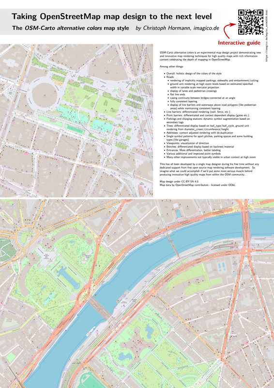
Taking OpenStreetMap map design to the next level. This poster features experimental map design innovations from the OSM-Carto alternative colors project with two map examples from Paris and explains various map design techniques visible in those maps. An optional digital guide is available through a QR code on the poster (https://imagico.de/map/ac_sotm2026.html), pointing to various locations in those maps and describing the map design techniques observable there.
Alvar Jolin-Lombardini
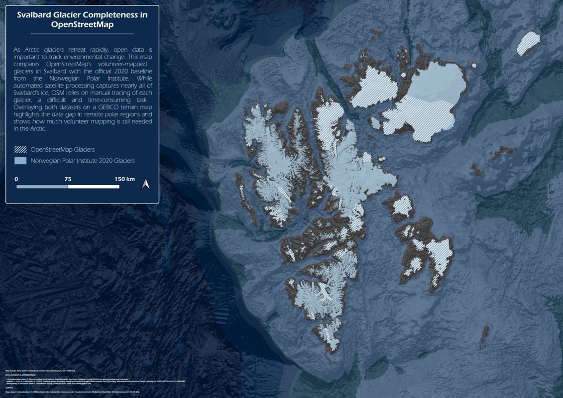
I made this map of Svalbard to visualize how much of the archipelago’s glacial ice has been added to OpenStreetMap compared to the Norwegian Polar Institute’s 2020 baseline. Because OSM relies on manual tracing rather than automated processing of satellite data, the comparison between the two shows the gaps in OSM data in remote polar regions, particularly for natural features.
Gauthier Le Tat et al.
Gauthier Le Tat, Ilyes Ahmim, Abderrezak Rachedi, Mohamed Chachoua, Ahmed Mebarki, Fabrice Vienne
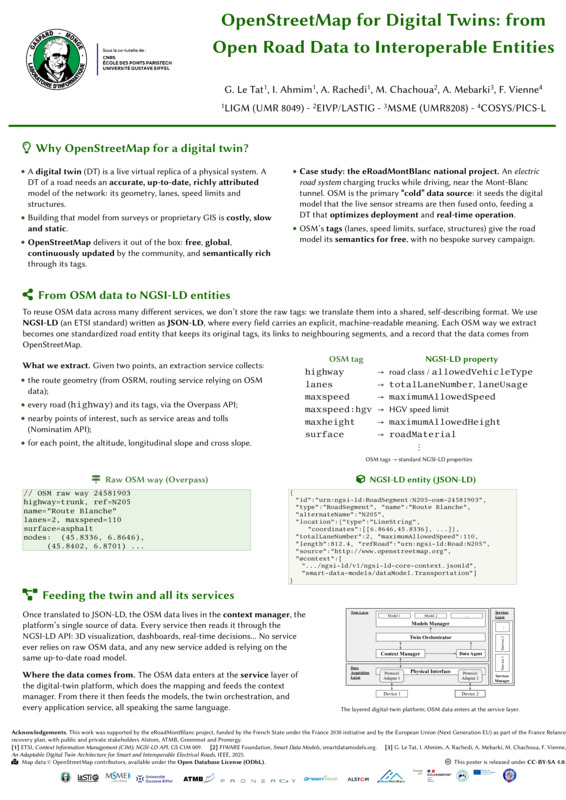
This poster shows how we use OpenStreetMap as the main open data source to build a digital twin of a road, within the eRoadMontBlanc electric-road national project. A small service extracts the road straight from OSM (route via OSRM, geometry and tags via Overpass, points of interest via Nominatim) and enriches it with altitude, longitudinal slope and cross slope. We then translate them into standardized, self-describing NGSI-LD entities (JSON-LD, following the FIWARE Smart Data Models), which is an ETSI standard widely used in the digital twin ecosystem. Expressed this way, the OSM-derived data lives in one context broker and feeds every service of the platform through a single API, so all services rely on standardized data, which can be enriched in real time with IoT sensors.
Generative AI has been used for the redaction of this poster during the redacting phase; for reformulation purposes, in order to enhance grammar and vocabulary for better legibility.
Moine Frédéric
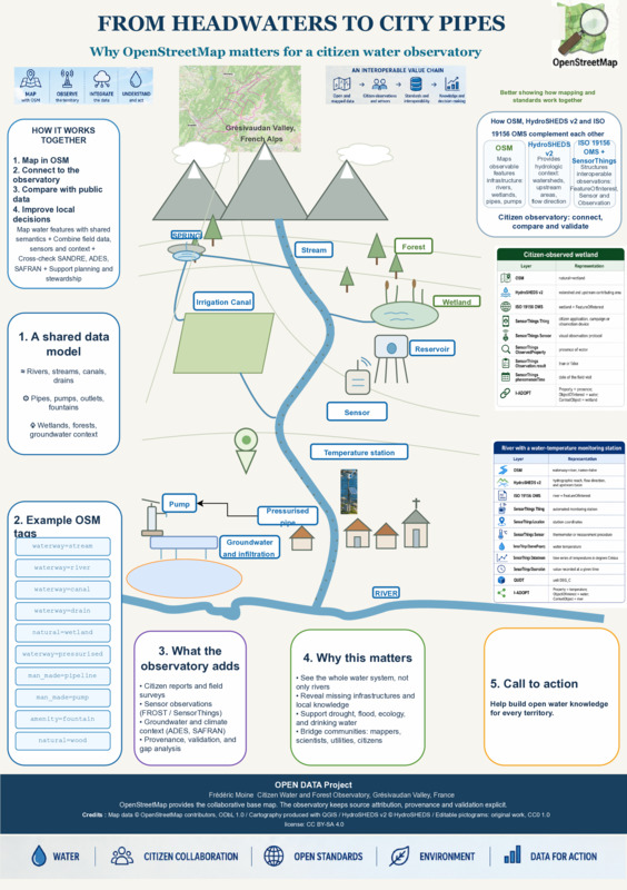
This poster presents a citizen water and forest observatory developed in the Grésivaudan Valley, French Alps. It shows how OpenStreetMap can describe water as a connected system, from springs, rivers and wetlands to irrigation and urban infrastructure. HydroSHEDS v2 is currently available only for the Americas, with no confirmed release date for the rest of the world. As HydroSHEDS also uses OpenStreetMap to improve its hydrographic network, strengthening water mapping through the global OSM community can benefit both present and future datasets. The poster also links OSM with ISO 19156 OMS, SensorThings, I-ADOPT and QUDT to connect mapped features with interoperable observations.
Priscilla Zachee
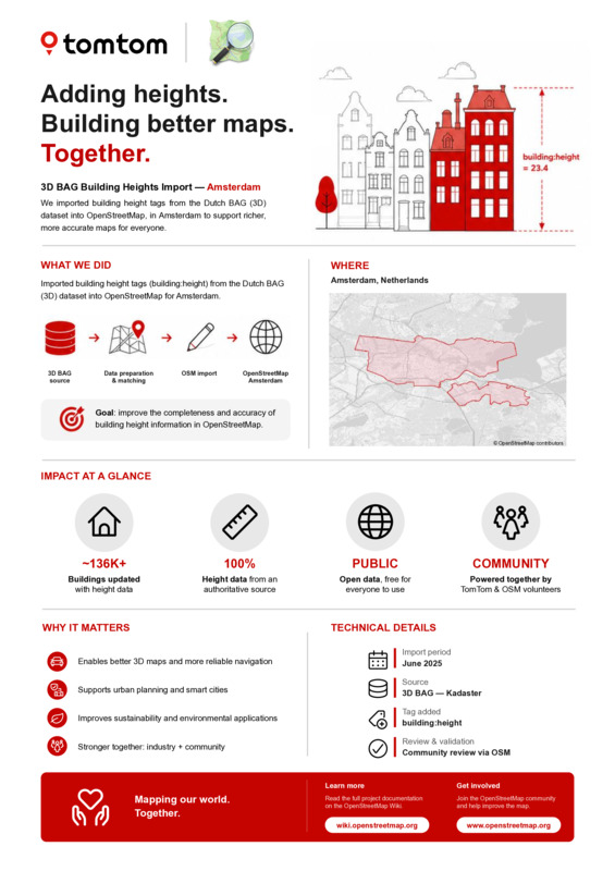
In June 2026, TomTom completed a building height tag import project in the OSM data for the city of Amsterdam, NLD with the valuable support and guidance of the community. This poster offers a retrospective on this activity.
Craig Durkin
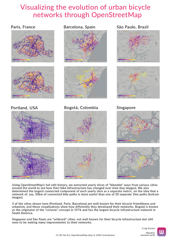
This poster uses OSM history data to visualize how the bicycle infrastructure networks of 6 cities (Portland, Paris, Barcelona, Singapore, Bogotá, and São Paulo) have evolved over time. It also looks at the “connectedness” of their networks, visualizing the largest connected component of their bicycle infrastructure network.
Samson Ngumenawe
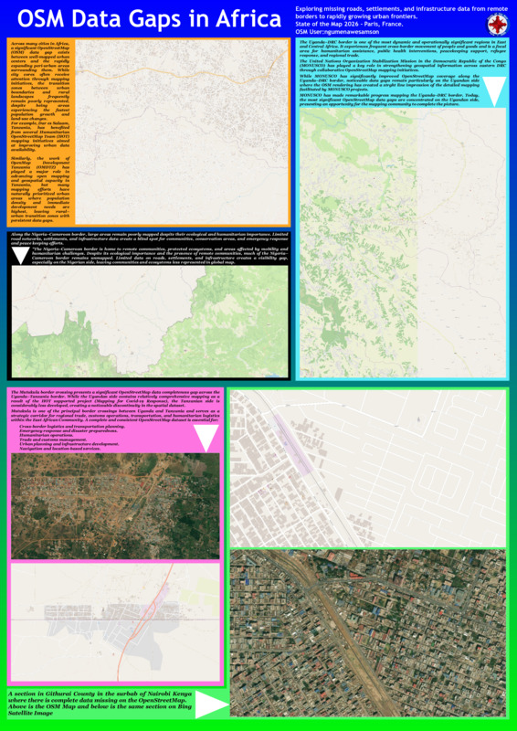
The poster depicts the existence of distinctive data gaps between African nations and cities.
Laura Mugeha
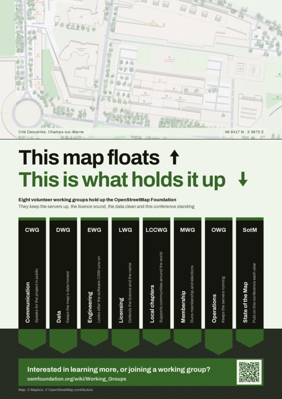
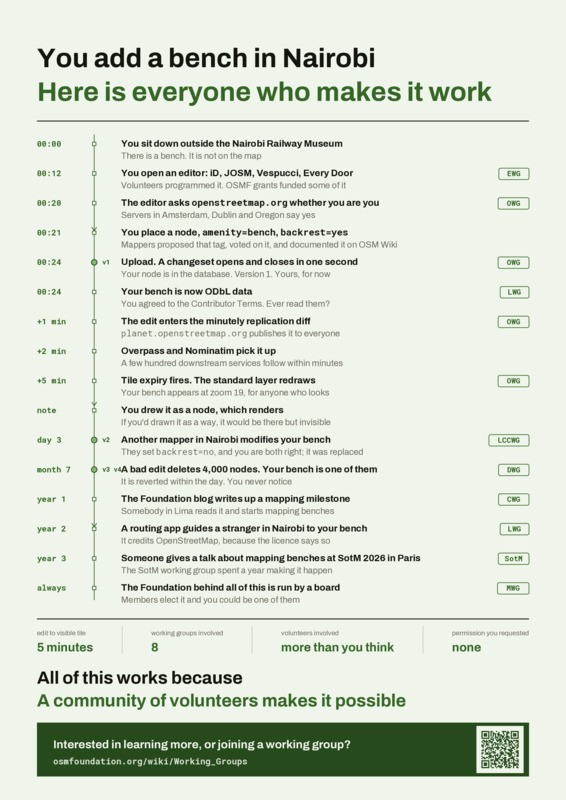
The OpenStreetMap Foundation and the OpenStreetMap project run on eight volunteer working groups that most mappers never encounter. They look after the servers, the license, the data, the members, the local chapters, and this conference. These two posters make that work visible. One shows the Foundation as a structure: the map you use, and the groups holding it up. The other follows a single map edit and everyone who touches it before and after it reaches a tile. These Working Groups are open to everyone, and they need people.
Dolly Andriatsiferana
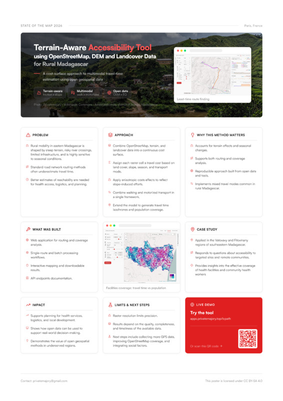
Rural mobility in eastern Madagascar is shaped by steep terrain, risky river crossings, and limited road infrastructure. Standard road-network routing often underestimates real travel time in these settings and fails to capture off-road and mixed-mode movement common to rural populations. I present a cost-surface approach to travel-time estimation that combines OpenStreetMap with Copernicus DEM and ESA WorldCover data into a continuous raster cost surface. Each raster cell is assigned a travel cost based on land cover, slope, season, and transport mode, with anisotropic cost effects applied to reflect the directional impact of slope on effort. The model integrates walking and motorized transport within a single framework, supporting both least-time routing and coverage analysis via travel-time isochrones. Cost parameters are calibrated and validated against sample GPS tracks collected in the field, grounding the model in observed travel behavior. I built a web application implementing this approach, offering single-route and batch routing, interactive mapping, downloadable results, and a documented API. I applied the tool in the Vatovavy and Fitovinany regions of southeastern Madagascar to assess accessibility, providing insights into effective service coverage relative to population distribution. This work demonstrates how open geospatial data and tools can support reproducible accessibility modeling in underserved, data-scarce regions.
OpenHerMap
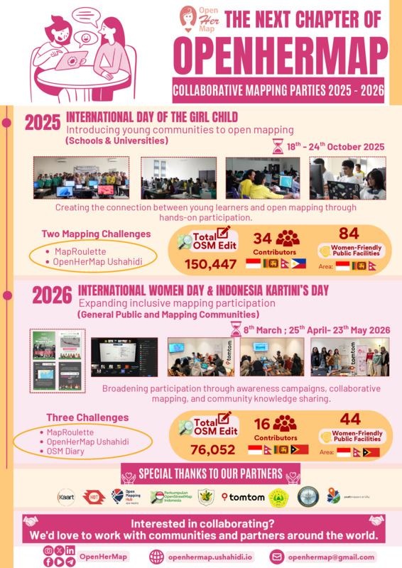
The Next Chapter of OpenHerMap: Collaborative Mapping Parties 2025-2026 showcases the continued growth of OpenHerMap in promoting inclusive and collaborative mapping through OpenStreetMap. Building on previous initiatives, the 2025 and 2026 mapping parties expanded international participation, strengthened partnerships, and encouraged more diverse ways to contribute. The 2025 Hybrid Collaborative Mapping Party, held from October 18th to 24th, celebrated the International Day of the Girl Child and focused on introducing young communities to open mapping. By engaging schools and universities, the event successfully created a strong connection between young learners and open mapping through hands-on participation. Through two mapping challenges, MapRoulette and OpenHerMap Ushahidi, the event brought together 34 contributors from Indonesia, Nepal, Sri Lanka, and the Philippines, resulting in 150,447 OpenStreetMap edits and 84 documented women-friendly public facilities. In 2026, the initiative expanded to the general public and mapping communities through events held on March 8th and from April 25th to May 23rd. Celebrating International Women’s Day and Kartini Day in Indonesia, this phase focused on broadening participation through social media awareness campaigns, collaborative mapping, and community knowledge sharing. Participants engaged in three community challenges: MapRoulette, OpenHerMap Ushahidi, and the OSM Diary. Supported by multiple community partners, the event involved 16 contributors from Indonesia, Nepal, Sri Lanka, and Timor-Leste, generated 76,052 OpenStreetMap edits, and documented 44 women-friendly public facilities. This meaningful two-year journey was made possible through the support of dedicated community partners, including Kaart, Humanitarian OpenStreetMap Team (HOT), Open Mapping Hub Asia-Pacific, Perkumpulan OpenStreetMap Indonesia (POI), SMK Adi Sanggoro, TomTom, Pakuan University, Women in Open Mapping: Asia Navigators (WOMAN), and YouthMappers at UNJ. As the initiative continues to evolve, OpenHerMap welcomes future collaborations with communities and partners around the world.
We used generative AI tools (Gemini AI and ChatGPT) strictly to help translate, improve the wording and grammar, and structure the text and abstract of this submission. All core ideas, statistics, documentation, and the poster design are entirely the original works of the OpenHerMap team.
Eddie Hsu
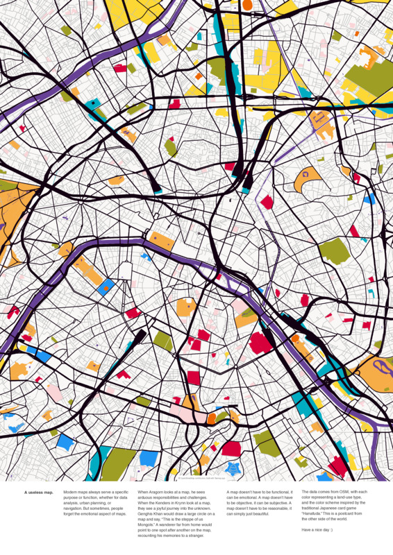
Contextless map art. Data from OSM, each color represents a type of landuse. The color palette is comes from a traditional Japanese card game “Hanafuda.”
Ezekiel Tobiloba Ogungbemi
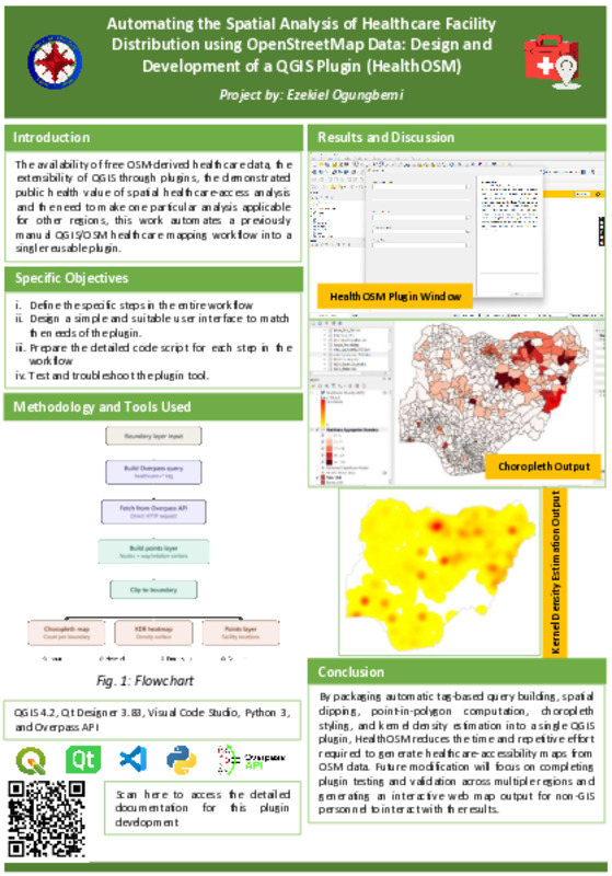
HealthOSM is a QGIS plugin designed and developed to automate the end-to-end extraction, processing, and visualisation of OpenStreetMap healthcare facility distribution within any user-defined administrative boundary with sub-administrative attributes. The specific objectives are to define the specific steps in the manual workflow, design a simple and suitable user interface to match the needs of the plugin, prepare the detailed code script for each step in the workflow, and test and troubleshoot the plugin tool. The plugin returns three outputs, including the extracted healthcare point data within the admin boundary via the Overpass API, a vector choropleth layer, and a raster kernel density estimation file. This production eliminates the repetitive effort of performing the analysis for multiple administrative boundaries. For future modifications, this plugin will return a simple interactive web map in addition to the existing outputs that can be easily accessed by non-GIS personnel to view the results without the need of GIS software.
Lorenzo Stucchi et al.
Lorenzo Stucchi, Anisa Kuci, Daniele Santini
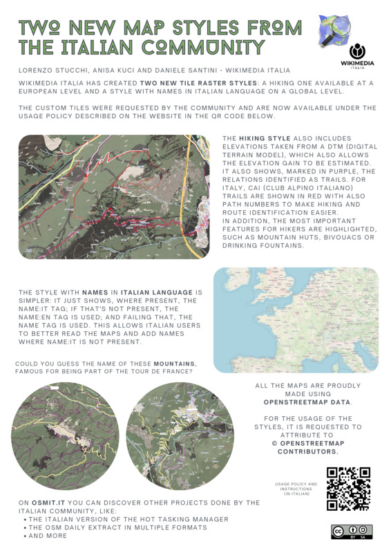
Wikimedia Italia has developed two new OpenStreetMap-based tile raster styles, created in response to community requests. The first, a hiking style available at European level, combines DTM-derived elevation data with highlighted trail relations and, for Italy, CAI trail numbers, alongside key features like mountain huts, bivouacs, and drinking fountains. The second, a globally available style, prioritises Italian-language place names, improving map readability for Italian users.
Jean-Louis Zimmermann
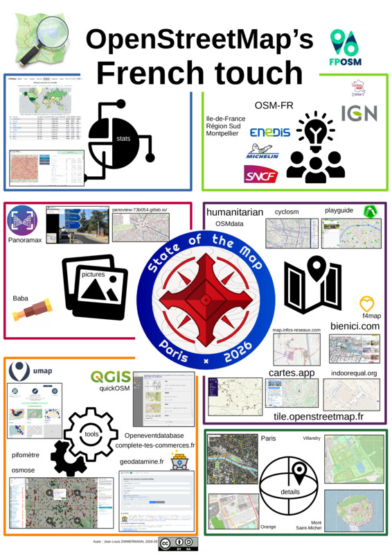
Just a poster showing some tools, maps, and others things that come from OpenStreetMap french community.